Embedded Analytics: A Non-Negotiable for User-Centric Software Companies

Embedded Analytics: A Non-Negotiable for User-Centric Software Companies

Written by

Ajit Monteiro, CTO & Co-Founder

Published

October 30, 2023

Data Analytics
Technology
Pyramid Analytics
Tableau
Power BI

In an era where data drives decisions, and subsequently, the trajectory of businesses, the adage “knowledge is power” has never been more pertinent. For software companies in particular, there’s a significant emphasis on not just gathering data but also on presenting it in a way that’s efficient, insightful, and user-friendly.
Embedded analytics plays a pivotal role in this data revolution. By integrating analytics capabilities and data visualizations directly into user workflows, applications, or portals, embedded analytics streamlines access to insights and provides users with a highly interactive and user-friendly data engagement experience. So, why is it an absolute must for software companies to embrace embedded analytics right now? Let’s explore.

1. Meeting the Surge of Enhanced User Expectations

Today’s software users, with the tech advancements and the data-rich platforms they’re accustomed to, have gone from being passive consumers of information to actively digging for deeper insights. Static reports just don’t cut it anymore. Users want analytics that are dynamic, interactive, and allow them to explore. Embedded analytics offers users the freedom to dissect and play with their data without ever leaving their operational environment, elevating user satisfaction and engagement.

2. Achieving Competitive Differentiation

In a market saturated with software solutions vying for user attention and loyalty, delivering enhanced, value-driven user experiences is paramount. Embedded analytics offers a competitive edge, setting software solutions apart by enriching user experience through tailored insights, predictive analytics, and real-time data interaction within the software itself. It becomes a significant differentiator that not only attracts users but also retains them by continuously adding value to their interaction with the software.
3. Enabling Informed, Real-time Decision-making

The ability to make well-informed decisions in real time has become a key factor in successfully navigating today’s fast-paced business landscape. Embedded analytics embeds critical data and insights directly into the user’s workflow, thereby not only streamlining decision-making processes but also ensuring that every decision is backed by insightful data without the need for disruptive shifts between operational and analytical tools.

4. Mitigating the Strain on Development Resources

As user demands for custom reports and deeper analytical insights increase, development teams often find themselves bogged down with requests for custom reports, diverting crucial resources from product development and enhancement. Embedded analytics alleviates this strain, empowering users with the tools to create, modify, and interact with reports autonomously, thereby freeing development teams to focus on core product development and innovation.
5. Sustaining Growth Through Scalable Solutions

As software companies evolve, so do their data needs and the analytical expectations of their users. Embedded analytics offers a scalable solution, accommodating growing data and user bases while ensuring that the analytical depth, interactivity, and user-friendliness of the platform are not compromised. This ensures that the software remains in alignment with user expectations and needs, safeguarding its relevance and utility in the long term.

6. Enhancing Customer Loyalty with Superior Experiences

In delivering an enriched, interactive, and autonomous data interaction experience, embedded analytics significantly enhances user satisfaction and loyalty. When users can derive actionable insights, sculpt reports, and explore data on a platform that is simultaneously robust in its operational and analytical capabilities, it instills a sense of autonomy, satisfaction, and loyalty towards the software, fortifying its user base against the allure of competing solutions.
7. Steering Towards a Future-Ready Model

As technology evolves, so will the methodologies in which data is presented and interacted with. Embarking on the embedded analytics journey now ensures that software companies are not playing catch-up in the future but are well-entrenched in the advanced data interaction models of tomorrow, ensuring sustainability, relevance, and leadership in the future data landscape.

Unlock Growth with
Embedded Analytics

The integration of feature-rich analytics within a SaaS application can fundamentally reshape the competitive landscape for software providers. As user expectations, market dynamics, and technological capabilities evolve, embedded analytics stands out as the beacon guiding software companies towards enriched user experiences, competitive differentiation, and strategic future readiness, making its adoption not just beneficial, but imperative.

For a deeper dive into how software companies can enrich user experiences and drive sustainable business outcomes with embedded analytics, view our comprehensive guide.

Get Started

OneSix helps companies build the strategy, technology, and teams they need to unlock the power of their data.

Why a Cloud-Based Data Architecture Is the Right Choice for Your Healthcare Organization

Why a Cloud-Based Data Architecture Is the Right Choice for Your Healthcare Organization

Published

July 10, 2021

Data & App Engineering
Healthcare & Life Sciences
Power BI
Tableau
Fivetran
Matillion
Snowflake

Patient demand for access to personal health data continues to increase while healthcare organizations strive to provide improved patient outcomes. At the same time, they are facing budget constraints, interoperability issues and privacy regulations. The Health Information Portability and Accountability Act (HIPAA) regulates how healthcare organizations update such accessibility, keeping data safety and integrity at the forefront.

Cloud-based data architecture improves the healthcare experience for both patients and healthcare organizations. Incorporating cloud-based applications and services as part of your healthcare organization’s data architecture can help improve patient access while following HIPAA laws. Cloud-based healthcare applications also save your team time and money, simplifying the approval process.

One Six Solutions brings these solutions to your healthcare organization with a modern, cloud-based data architecture.

Reduced costs and improved scalability

With large quantities of patient and company data coming from a multitude of sources, a cloud-based system allows your company to operate at scale and at budget.

Trying to guess the correct number of servers as well as other hardware and software needs for your organization are time-consuming and costly. A cloud data warehouse meets all of your organization’s data needs now and into the future. It allows you to scale your storage and computing power to meet your needs within minutes.

Cloud computing allows your healthcare organization to pay for the storage and services you need now, rather than continuing to struggle with legacy technology. In partnership with One Six Solutions, you ensure that your organization has the latest technology at its fingertips without incurring a greater spend.

Incorporating cloud-based applications and services also saves your team time and money by freeing your IT employees of tedious tasks such as tending to and upgrading in-house servers and deploying updates.

A simple, yet powerful cloud data warehouse such as Snowflake provides a fully managed, pay-as-you-go service that is secure. Financially, the costs are based only on the storage and compute you use.

Interoperability across the organization

Your healthcare organization’s interoperability depends on the movement of data from source systems to a centralized location for holistic analytics. Today, because of the cost-effectiveness and power of the CDW, data transformations can happen after the data is fully replicated from the source to the warehouse on a repeatable schedule by leveraging tools like Matillion.

Today’s cloud-based products provide faster and more robust capabilities for your organization than connectors custom built by consulting firms or in-house developers. With a few clicks of a button, platforms such as Fivetran or Matillion’s Data Loader provide full data replication of a wide array of applications and databases into a cloud data warehouse.

Equally important, cloud-based patient data provides interoperability with your organization’s external partners such as pharmaceutical companies, insurance claims and payments. A cloud-based approach allows information to flow seamlessly between individuals and organizations that require access to it while still protecting its sensitive nature. Therefore, healthcare delivery improves and becomes more efficient in the cloud.

Faster time to insight

Whether it is TableauPower BIQlik Sense or any number of tools in this space, cloud offerings provide a fully managed instance for a single browser-based access point for dashboards and reports.

Improved patient outcomes

One of the most important measures of healthcare is the final outcome. Patients seeking to improve that outcome require on-demand access to their healthcare information to make better life decisions.

If you’re interested in migrating your healthcare organization’s data to a personalized, cost-saving and safe platform, contact us for additional information. The team here at One Six Solutions has worked with a wide array of technologies in the healthcare data world. Our goal is to design and build an architecture that works best for you based on your organizational and business needs. Let us know how we can help.

A Modern BI Primer (And Why Less is More)

A Modern BI Primer (And Why Less is More)

Published

March 5, 2020

Data & AI Strategy
Tableau
Power BI
Matillion
Snowflake

With a data technology landscape that is ever changing, it is at times a challenge even for technology firms to sort through the latest key terms and platforms that pervade the marketplace, each touting its advantage over the status quo. How much more a challenge, then, for organizations where technology is not their primary expertise? From a myriad of choices to build a modern data architecture for a competitive edge, what must companies buy and leverage to start or pivot their data journeys?

This primer is intended to educate a growing number of clients we see in the Small and Medium-Size Business (SMB) segment who are looking for a good framework to consider as they think through their future data capabilities.

So what makes a business intelligence (BI) or data architecture? And what do we mean when we say less is more as it relates to this architecture? Regardless of the technology stack that eventually gets approved and implemented, our team at One Six likes to speak of tools and platforms in terms of four big buckets:

Data Acquisition

What is it? This bucket is the piece of the architecture where we consider the movement of data from source systems to a centralized location for holistic analytics.

Why less is more: There are products in this space today that frankly provide faster and robust capabilities for clients than connectors custom built by consulting firms or in-house developers. With a few clicks of a button, platforms such as Fivetran or Matillion’s Data Loader provide full data replication of a wide array of applications (e.g., SalesforceGoogle Ads) and databases (e.g., SQL ServerMongoDB) into a cloud data warehouse. Fivetran, in particular, detects changes to the source system automatically and moves data over seamlessly. Subscribing to managed services by leaders in this space means less maintenance activities for your internal IT group and more time to focus on value-added tasks downstream.

Data Warehouse

What is it? Whether you hear terms like data lake, data warehouse, or data lakehouse, here we are discussing a part of the architecture that stores information from disparate systems for historical, current, or forecasted analyses.

Why less is more: Rather than trying to estimate the right-sized on-premise hardware and software that is required to house all current and future data, consider a cloud data warehouse (CDW) that scales storage and computing power up and down as you need within minutes. Unless you are an organization at the scale of Netflix or Airbnb, a complex architecture is not necessary. A simple yet powerful cloud data warehouse like Snowflake provides a fully managed, pay-as-you-go service that is secure and costs are based only on the storage and compute you use. Again, less burden on your internal team, and more flexibility to build the structures you need to analyze your data efficiently. Plus, as your company grows and data volume grows as a result, the CDW can grow with you.

Data Transformation

What is it? When it comes to data, there have always been and will still be a need to clean, wrangle, and structure data in a way that makes sense for reporting. This bucket relates to the architecture piece where this transformation takes place.

Why less is more: Putting this as the third bucket is intentional. In the old world, a separate staging server was required to process data transformations prior to loading into a data warehouse. In addition, not all data from the source moved to the data warehouse due to cost of storage and compute. Today, because of the cost effectiveness and power of the CDW, data transformations can happen after the data is fully replicated from the source to the warehouse on a repeatable schedule by leveraging tools like Matillion. This means the transformations happen in the data warehouse itself so you can remove the maintenance and costs of a staging server. Even more, the low cost of storage allows the data warehouse to have all data from the source system immediately available for any changes to reporting needs.

Data Analytics

What is it? This bucket is the most visible component to a BI or data architecture. Here we are looking at product capabilities for building standardized dashboards as well as ad-hoc analyses that will be consumed by a wide audience in an organization.

Why less is more: Whether it is TableauPower BIQlik Sense, or any number of tools in this space, cloud offerings provide a fully managed instance that provides a browser-based, single access point for dashboards and reports. Less management and increased accessibility. In general, while each tool has its advantages, we continue to see tools moving towards parity. Here, a data governance strategy is key is reducing the number of data sets and reports while promoting the reusability of well-structured, certified data sets. This reusability increases the trust of the data and also empowers business users to find answers to questions on their own not found in standardized dashboards. And with tools like Ki and DataRobot that can augment established BI tools with its artificial intelligence and machine learning capabilities, we see increasing ways for analysts to solve business problems that we can provide guidance on.

Final Thoughts

So there you have it – Data Acquisition, Data Warehouse, Data Transformation, Data Analytics – four big buckets to easily see what you need to consider in a modern BI architecture. We hope that this modern BI primer has been helpful as you take the next steps into your organization’s data journey. Please note that the above technology platforms listed were used as examples only. The team here at One Six Solutions works with a wide array of technologies in the data world. Our goal is to design and build an architecture that works best for you based on your industry and business needs. Let us know how we can help.

Setting default date to Today with an option to set custom date in Tableau

Setting default date to Today with an option to set custom date in Tableau

Published

October 16, 2019

Data Analytics
Tableau

Tableau is one of the best business intelligence and analytical tools out there to get insights about your data. It is very interactive and easy to use but it can be difficult to get some basic filtering to work. In a recent project I worked on, the client wanted to get metrics in a date range but wanted the dashboard and reports to default to today’s date. Tableau doesn’t have this feature built in.

Tableau does have date filters that are great and in most scenarios, those should suffice however in my case I needed the workbook to display metrics for current date by default and give the user an option to choose from a custom date range. Here is a how I did it. The solutions consisted of:

The solutions consisted of:

3 parameters (the type of date to select, Start Date and End Date)
A calculated field to be used as a filter.

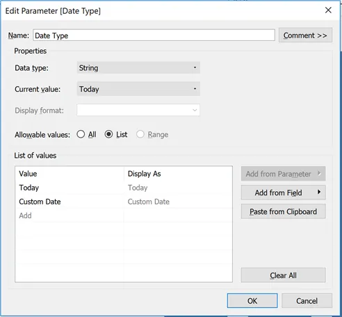
First, Lets start with creating a list parameter titled “Date Type” with a data type of string and the list of values of Today and Custom Date. Set the Current value to “Today.”

We then create 2 additional parameters for “Start Date” and “End Date” with a data type of Date, Display format to Automatic and Allowable values to All. These parameters will give the user the ability to select the date range.

Start Date and End Date parameters

Now that the parameters we need have been created we need to add the functionality so that the data displayed matches accordingly to the selected option a user chooses.

To do this we will create a calculated field called “Date Filter.” It looks something like this:

The IF statement sets a filter condition based on the Date Type selected by the user. If the condition matches the result is a 1 otherwise it will display a 0. This calculated field will be created as a measure. Right click on the field and convert it to a dimension, drag it to the filter shelf and select 1 in the value.

That’s it. Now go ahead and add the parameters to your report and the users will have the ability to select a date type for their reports and dashboards.

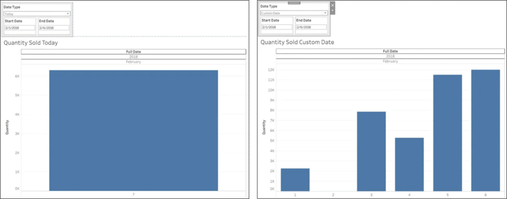
Today vs Custom Date selection

Today vs Custom Date selectionThis is a quick solution to creating a date field that defaults to today in addition to giving an option to specify a custom date. Additional customization can be done to hide the Start Date and End Date parameters when Today is selected from the drop down.

Another application for this can be having preset time periods. For example you can add YTD, MTD WTD values in the date type parameter and when YTD is chosen the dashboard displays a comparison between YTD this year vs last year.

OneSix is a Tableau Consultant

We help companies solve their most complex problems with cloud technology and yield incredible results.

Building a “scrollable” dashboard for the iPad in Tableau

Building a “scrollable” dashboard for the iPad in Tableau

Published

October 3, 2019

Data Analytics
Tableau

A recent customer request for a “scrollable” dashboard in Tableau left me stumped for a while. I thought I’d share what I learned as it took me quite a bit of online search time and experimentation to reach the solution.

The customer intended their new dashboard to be accessed via standard-issue iPads (made available to each member of their management team). The dashboard width would be set appropriately for the screen size of these iPads. The dashboard length would be variable, as the vertical space required to present the last chart could differ substantially based on the dashboard user’s selection of the geography to filter to. The customer stated that they wanted the last chart to take up as much space as it needed for legibility, and that users should be able to scroll down through it by swiping their iPad screen.

I can’t share the dashboard that I made for my customer, but I have made a similar one (using publicly available data) for illustration purposes. Below is a partial screenshot of that dashboard:


Users of this dashboard may select a US Census region from the filter drop-down at top right. The top-most chart then displays overall marriage (formation) rates for that region for the years 1999 through 2016. After that we have a chart that displays marriage rates for each of the states making up the region for the same period. Since the number of states to be displayed varies by region, it isn’t possible to set a fixed height for this chart. It will have to be able to dynamically resize so that information for each state remains legible.


The first step in building this dashboard was to set its’ size appropriately. I set it to Fixed size with a width of 1024 pixels (standard for an iPad) and a height of 4000 pixels which is the maximum height that Tableau currently allows. I had first tried setting up the size using the Ranged option, allowing the height to be variable. I found that, with that option, my second chart was not consistently free to resize regardless of how I set the height range. With a fixed height of 4000 there will be white-space below the dashboard, but it’s easily ignored by the user on an iPad.

This dashboard flows vertically not horizontally, so the next step was to drop a vertical layout container onto the dashboard canvas (leaving the default “Tiled” mode selected for the layout). I then dropped a horizontal layout container inside the vertical container, checked the “Show dashboard title” option and dragged the title inside the horizontal container.


I dropped the first chart, showing overall marriage rates for a select region, into the vertical container so that it could take up the entire dashboard width. Dropping in that chart caused its’ accompanying Region drop-down to appear on the dashboard. I moved it inside the horizontal container so that it would appear (opposite the title) at the top of the dashboard. Finally, I dropped in the second chart, showing marriage rates by state, below the first in the vertical layout container.


Initially both charts were defaulted to dynamic height and “Standard” fit to their layout container. I set the first chart’s fit to “Fit Width” and then fixed its’ height by clicking and dragging its’ lower edge to the desired position.


I set the second chart’s fit to “Entire View” but this had the immediate effect of stretching the chart vertically to take up all the remaining vertical height. In this example dashboard the effect is not disastrous, but in the dashboard built for my client this created a pronounced “funhouse mirror” effect on the chart for some geographies.


I tried to resize the second chart by clicking and dragging, but Tableau wouldn’t permit any vertical resizing of the chart. I found that I could resize the chart by selecting “Edit Height” from the chart’s options menu (down arrow in the upper right of the screenshot above). However as soon as I was able to resize I realized that wasn’t really what I wanted: the whole point was to let this chart have dynamic height, but I didn’t want it taking up the entire available vertical space.

Finding a way to get the right kind of control over the chart’s sizing took me longer than I care to admit. The solution hinged on another available dashboard object that I had not yet used: the blank. When placed as the “last” object in a layout container, a blank object expands by default to take up any unneeded space in the container after the preceding objects in that container are sized. I dropped a blank into the vertical layout container below the second chart, then made sure that the “Fixed Height” toggle (the “pushpin” pictured above) was turned off for both the second chart and the blank. With that simple change, the second chart expanded and contracted in a natural manner based on the region selection made by the user. The blank “soaked up” the rest of the 4000-pixel vertical space.


I’ve since learned that the blank can come in handy whenever you need more control over the spacing of other dashboard objects and you want to stick with the “Tiled” layout type. Hopefully, paying attention to the humble blank will keep you from some of the problems I’ve encountered as you build your own Tableau dashboards!


Ajit is an AWS Certified Solutions Architect and a member of the One Six Solutions team.