Building a “scrollable” dashboard for the iPad in Tableau
Published
October 3, 2019

A recent customer request for a “scrollable” dashboard in Tableau left me stumped for a while. I thought I’d share what I learned as it took me quite a bit of online search time and experimentation to reach the solution.
The customer intended their new dashboard to be accessed via standard-issue iPads (made available to each member of their management team). The dashboard width would be set appropriately for the screen size of these iPads. The dashboard length would be variable, as the vertical space required to present the last chart could differ substantially based on the dashboard user’s selection of the geography to filter to. The customer stated that they wanted the last chart to take up as much space as it needed for legibility, and that users should be able to scroll down through it by swiping their iPad screen.
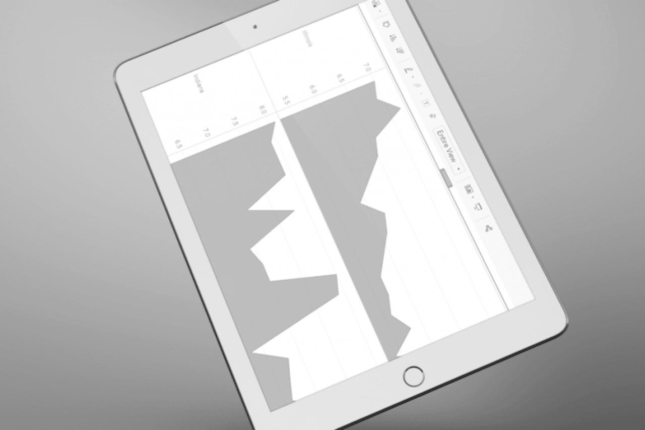
I can’t share the dashboard that I made for my customer, but I have made a similar one (using publicly available data) for illustration purposes. Below is a partial screenshot of that dashboard:
Users of this dashboard may select a US Census region from the filter drop-down at top right. The top-most chart then displays overall marriage (formation) rates for that region for the years 1999 through 2016. After that we have a chart that displays marriage rates for each of the states making up the region for the same period. Since the number of states to be displayed varies by region, it isn’t possible to set a fixed height for this chart. It will have to be able to dynamically resize so that information for each state remains legible.
The first step in building this dashboard was to set its’ size appropriately. I set it to Fixed size with a width of 1024 pixels (standard for an iPad) and a height of 4000 pixels which is the maximum height that Tableau currently allows. I had first tried setting up the size using the Ranged option, allowing the height to be variable. I found that, with that option, my second chart was not consistently free to resize regardless of how I set the height range. With a fixed height of 4000 there will be white-space below the dashboard, but it’s easily ignored by the user on an iPad.
This dashboard flows vertically not horizontally, so the next step was to drop a vertical layout container onto the dashboard canvas (leaving the default “Tiled” mode selected for the layout). I then dropped a horizontal layout container inside the vertical container, checked the “Show dashboard title” option and dragged the title inside the horizontal container.
I dropped the first chart, showing overall marriage rates for a select region, into the vertical container so that it could take up the entire dashboard width. Dropping in that chart caused its’ accompanying Region drop-down to appear on the dashboard. I moved it inside the horizontal container so that it would appear (opposite the title) at the top of the dashboard. Finally, I dropped in the second chart, showing marriage rates by state, below the first in the vertical layout container.
Initially both charts were defaulted to dynamic height and “Standard” fit to their layout container. I set the first chart’s fit to “Fit Width” and then fixed its’ height by clicking and dragging its’ lower edge to the desired position.
I set the second chart’s fit to “Entire View” but this had the immediate effect of stretching the chart vertically to take up all the remaining vertical height. In this example dashboard the effect is not disastrous, but in the dashboard built for my client this created a pronounced “funhouse mirror” effect on the chart for some geographies.
I tried to resize the second chart by clicking and dragging, but Tableau wouldn’t permit any vertical resizing of the chart. I found that I could resize the chart by selecting “Edit Height” from the chart’s options menu (down arrow in the upper right of the screenshot above). However as soon as I was able to resize I realized that wasn’t really what I wanted: the whole point was to let this chart have dynamic height, but I didn’t want it taking up the entire available vertical space.
Finding a way to get the right kind of control over the chart’s sizing took me longer than I care to admit. The solution hinged on another available dashboard object that I had not yet used: the blank. When placed as the “last” object in a layout container, a blank object expands by default to take up any unneeded space in the container after the preceding objects in that container are sized. I dropped a blank into the vertical layout container below the second chart, then made sure that the “Fixed Height” toggle (the “pushpin” pictured above) was turned off for both the second chart and the blank. With that simple change, the second chart expanded and contracted in a natural manner based on the region selection made by the user. The blank “soaked up” the rest of the 4000-pixel vertical space.
I’ve since learned that the blank can come in handy whenever you need more control over the spacing of other dashboard objects and you want to stick with the “Tiled” layout type. Hopefully, paying attention to the humble blank will keep you from some of the problems I’ve encountered as you build your own Tableau dashboards!
Ajit is an AWS Certified Solutions Architect and a member of the One Six Solutions team.